Skyscanner: Usability Evaluation & Site Redesign
For this 3rd Challenge, Ironhack decided to make us travel by jumping into the shoes of a world traveler. We’ll combine UX and UI design by testing the usability of a travel search engine.

Being critical about other sites and apps sharpens our designer eye. What works? What doesn’t? Why? Answering these questions, we can subsequently understand how to create the most usable design.
This is what we will try to do with Skyscanner site.
To achieve this, we’ll establish a traveler profile, a benchmark of travel agency comparator, a user test, an insight, and finally a redesign of the site’s wireframe. Let’s plan our next trip to one of the seven wonders of the world: Machu Picchu!
1. User Type
I first defined a user profile: The young group of friends.
They are between 20–40, they want to live a unique experience and to share quality time together. They are part of a generation that travels the world easily thanks to the affordable tickets, even though they are increasingly aware of their carbon footprint. They plan their trip for next summer and they have to adapt to everyone’s schedules. They are interested in a mix of culture and leisure, and although they are always price-conscious, this trip is a chance to spoil themselves.
The Machu Picchu is the ideal place for a mix of nature, adventure, and cultural site discovery. They’ve planned to travel during June-July because, during this period, Peru weather conditions are very pleasant. Also, they would love to attend the sun festival “Inti Raymi” on June 24th.
Presentation of my 4 users:

The curious traveler (25)
She loves art and balances her time between visiting sites and museums and exploring the country’s culture. When traveling, she needs a minimum of comfort and pays a little more if it allows her to have a better stay.

The real backpacker (26)
He is passionate about travel and adventure. He has visited many countries worldwide, and he is not afraid of the unknown or discomfort. He prefers the cheapest plane ticket to allow himself to live extraordinary experiences in the country.

The broke student traveler (23)
She pays attention to her budget. She works a lot so, during her holidays, she likes to make the most of the stay with her friends without worrying about the organization. She wants flexibility in travel schedules.

The perfectionist traveler (27)
When traveling, he likes everything to be perfect and favors the quality of the experience rather than the cost. During his trips, he likes to have fun, to see beautiful places and he pays the price if it allows him to make the most of it.
2. Specifics of the destination
- Flight itinerary: Departure from Paris → Stopover in Lima airport → Arrival at Cuzco airport
- Currency and exchange: 1€ = 4.27 Peruvian Soles
- Wardrobe recommendations: Backpack, hiking boots, rain jacket, T-shirt, and sweater
- Days needed to visit attraction: From 1 day to a week.

3. Benchmarking
I benchmarked 3 travel comparators: Kayak, Tripadvisor, and Skyscanner, using Usability Heuristics evaluation with Nielsen’s Principles:

I concluded that Skyscanner is the most suitable for my selected user type. At this stage, they prefer to start with plane ticket purchase. They favor Tripadvisor for restaurants and inspiration once they get to the country. Also, 3 of my users generally buy “Le guide du Routard” for cultural advice and recommended places.
4. User test
Look and feel
I sent a screenshot of Skyscanner site homepage to my 4 users, with a 5-second delay. Once the image was gone, users had to answer these 3 questions:

My 4 users perfectly did the 5-second exercise without any difficulty, even if they didn’t know Skyscanner. The home page design makes the site perfectly recognizable and identifiable. The page, therefore, includes all necessary elements features.
Usability test
I then gave two tasks to my users:
- Imagine yourself traveling to Machu Picchu for holidays with friends. Go to the Skyscanner site and find your own Paris-Cuzco plane ticket, from June 19 to July 4. You must go through to the end of the task without my help. Obviously don’t buy the ticket for real, even if you are very tempted to do so!
- Take a look at the accommodations and car rentals on-site if you wish. (I didn’t immediately give this instruction to my users, so I could see if they were going to do it spontaneously.)
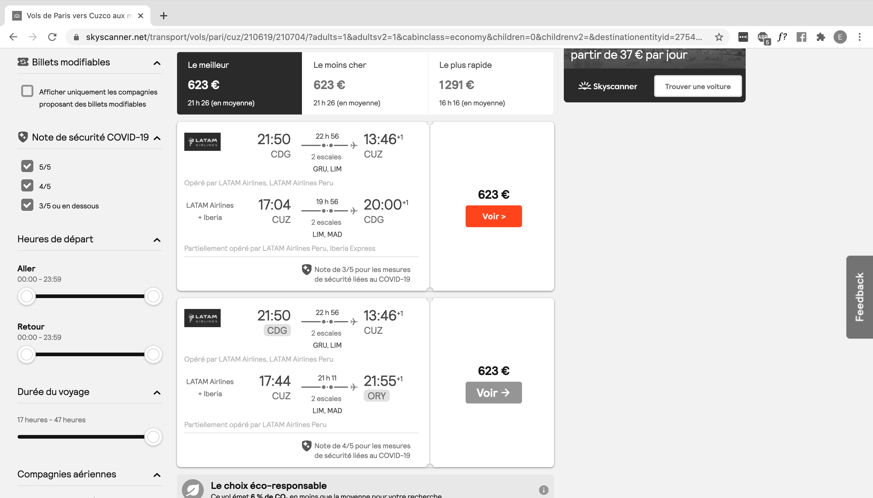
My 4 users seemed very familiar with this kind of website. They easily found the features they needed. All of them selected the lower price, even if the trip includes 2 stopovers.
They don’t want to identify themself on the site to carry out the research or to get a price alert. All users automatically closed all pop-ups that appeared without ever reading them.
All my users would have preferred to be sent to the airline site to take their tickets, and have fewer intermediaries possible.
5. Insight
I summarized the findings and test results to understand what to improve in a future iteration of Skyscanner site.
The flight search
What works:
- The overall design of the site, which is very professional, reassuring, and meets its function.
- The design of the calendar adapted to the French disposal, with the week starting with Monday and the dividing line to isolate weekends.
- Covid information. They like to be reassured in this uncertain time, especially given the high price of the ticket.
- One of the users liked the “eco-responsible choice”, but changed her mind after some thought, saying it was a bit hypocritical.
- One of the users liked seeing the logos of travel agencies.
Pain points:
- 3/4 of users were very surprised that they were unable to purchase tickets directly on Skyscanner. They felt very frustrated to be sent to another site to continue their purchase.
- All my users don’t trust sales sites (like Opodo, My Trip, Gotogate) because the final cost is often much higher than the initial price, and additional costs are added without their noticing.
- The little +1 next to the arrival time is not obvious. For long journeys, the day of arrival is not necessarily the same as in the country of origin: this can be confusing if you are not used to jet lag.
- 3/4 didn’t understand the difference between the “best” and “cheapest” trips classifications. In the case of the Paris-Cuzco flight, it was exactly the same price.
- The summary page contains too much information, it doesn’t make them want to read and they lost patience.
To summarize:
Users rather trusted the site’s flight proposals, but paradoxically not the ticket purchase pages on which they were sent.
Housing & Car Rental research
What works:
- Housing information hierarchy: When searching for accommodation, my users want to see photos first, then ratings and user reviews, then location. Skyscanner’s photos are quite large and are the first thing you see.
Pain points :
- None of my users knew that Skyscanner was also a car rental and housing comparator.
- Users do not use the accommodation function. They are used to use other sites like Tripadvisor or Booking which are more efficient for this. On Skyscanner site, all ratings and reviews on accommodations are those of Tripadvisor so they find this redundancy unnecessary.
- My users assumed that in the case of a trip to Machu Picchu, housing choice can be spontaneous, depending on the duration of the trek, what the group wants to do, unexpected events, and so on. They don’t want to choose accommodation for now.
- None of my users have decided to take the car option. They think that car rental is not suitable for some countries (India for example). In the case of Machu Picchu, they were convinced that walking or local transport was more suitable for this type of trip. They prefer to go through specialized companies, or directly on site.
- Users would like a link to the hotel site in addition to the booking site.
To summarize:
Users do not necessarily want to search for housings. As the name suggests, Skyscanner’s expertise is in flights.
6. Redesign
Sketching and Prototyping
When we click on the trip that interests us, a new summary page opens. I think this page is useless because users think they can buy their ticket directly from this page, but it’s not possible. They are confused because there is too much information, and they think the purchasing companies' logos are unnecessary advertising, even though this is where they can buy their ticket.


The idea is to delete this summary page and replace it with a modal dialog with the necessary information about the flight, and the logos of partner sites, so that we can directly understand that Skyscanner does not offer the purchase function.


I also reviewed the elements of the timetable of the journey. I really wanted to highlight the arrival date in case there is a +1 next to the time.
This +1 is not necessarily understandable for everyone, so I added the date in the country on arrival if there was a jet lag with the date at the time of departure, to avoid any confusion.


Try the prototype here:
What did I learn?
This task was very, very challenging. I had to do deeper user research to try to create an ingenious redesign proposal. I personally use this kind of website and I was not aware of certain problems, which the interviews allowed me to clarify. I had to be closer to users’ expectations and put myself in their shoes to collect the pain points and select the most significant.
I acquired a better methodology for the future by applying the Heuristic Evaluation, the Benchmark, the five-second test, and by taking advantage of my interviews to propose solutions in prototype form. I know this challenge is not over because there are still a thousand ways to improve what matters most to us: the user experience.
Thank you for your time, hope you enjoyed my article.
See you soon for the 4th and final challenge of this Ironhack pre-work.
All of your comments and 👏 are very welcomed!
Cheers!
